TYPEFACE DESIGN
TYPEFACE STUDIO
ARCHITECTURE


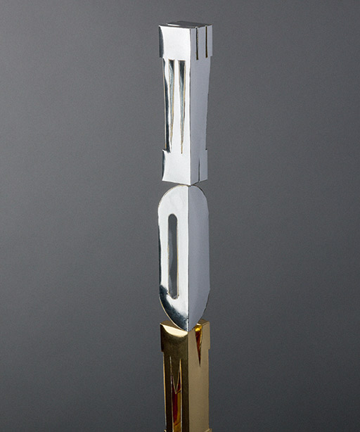
AMBIGUOUS WOODEN SCULPTURE Photo | Michael Brosnan
2D/3D TYPEFACE DESIGN
INSPIRATIONAL PHOTOS AND SKETCHES
ORIGINAL SKETCH Inspirational drawings + First Grid 3D Sketch 2008
OBJECTIVE
To visualize a good-looking 2D typography that could one day be materialised as a fundamental iconic structure of architecture.
APPROACH
I created the typeface Architecture in TypeTool. Like a city’s development, the conception of the design was like a metaphor for modernity and innovation.
It was also reminiscent of the days when I learned graphic design at high school, the process of this design resembled elements of creating 3D structures in degrees and calculating
angles on paper. Therefore, while building these actual letters I felt that the process was similar to that of designing buildings. Therefore, I felt it was most appropriate to name this typeface ‘Architecture’, because of its close resemblance to that of structural engineering and design.
OUTCOME
I consider the visualization process of drawing a 3D font on paper, as a naive response, rather than one based purely on order and perfection. It wasn’t until I used the program TypeTool, that my conceptualizing took on a secondary analogy. With digital technology challenging my perception of design, I could get an instantaneous exactness and perfection, making my architectural fonts look more convincing as structures.
Here, technology actually serves my desires and perceptions and takes me beyond the conventional process of design into virtual reality, where my designs can be instantaneously immortalized for global distribution and appreciation.
TYPEFACE DESIGN
TYPEFACE STUDIO
ARCHITECTURE OBLIQUE
ORIGINAL SKETCHES
Here, I have illustrated my original sketches for Architectural Oblique. I originally called the 3D font ‘Bad Education’ as they resembled building rods for learning mathematical equations. It wasn’t until I used the Type tool program that I realized how precise and intricate the designs were to create. The process and the precision required were the same as engineering complex building structures. It was at this point in time that I envisaged its potential and renamed the font, ‘Architecture’.


TYPEFACE DESIGN
TYPEFACE STUDIO
ARCHITECTURE REGULAR
ORIGINAL SKETCHES
The second series of sketches display Architecture Regular in its infancy, with its facades and right-hand sides in view. The 3D font’s opposing walls are free of realisation and are left to the imagination of the viewer.


TYPEFACE DESIGN
ARCHITECTURE REGULAR
BLUEPRINT

TYPEFACE STUDIO
TYPEFACE DESIGN
ARCHITECTURE OBLIQUE
BLUEPRINT

TYPEFACE STUDIO
TYPEFACE DESIGN
ARCHITECTURE BLACK REGULAR
BLUEPRINT

TYPEFACE STUDIO
TYPEFACE DESIGN
ARCHITECTURE BLACK OBLIQUE
BLUEPRINT

TYPEFACE STUDIO

PROJECT CREDITS
Concept and Design: Michael Brosnan
Tools: Pencil and Paper, Adobe Illustrator, FontLab 7
ARCHITECTURE
INSPIRATIONAL PHOTOS AND SKETCHES


AMBIGUOUS WOODEN SCULPTURE Photo | Michael Brosnan
2D/3D TYPEFACE DESIGN
ORIGINAL SKETCH Inspirational drawings + First Grid 3D Sketch 2008
OBJECTIVE
To visualize a good-looking 2D typography that could one day be materialised as a fundamental iconic structure of architecture.
APPROACH
I created the typeface Architecture in TypeTool. Like a city’s development, the conception of the design was like a metaphor for modernity and innovation.
It was also reminiscent of the days when I learned graphic design at high school, the process of this design resembled elements of creating 3D structures in degrees and calculating
angles on paper. Therefore, while building these actual letters I felt that the process was similar to that of designing buildings. Therefore, I felt it was most appropriate to name this typeface ‘Architecture’, because of its close resemblance to that of structural engineering and design.
OUTCOME
I consider the visualization process of drawing a 3D font on paper, as a naive response, rather than one based purely on order and perfection. It wasn’t until I used the program TypeTool, that my conceptualizing took on a secondary analogy. With digital technology challenging my perception of design, I could get an instantaneous exactness and perfection, making my architectural fonts look more convincing as structures.
Here, technology actually serves my desires and perceptions and takes me beyond the conventional process of design into virtual reality, where my designs can be instantaneously immortalized for global distribution and appreciation.
TYPEFACE DESIGN
TYPEFACE STUDIO
ARCHITECTURE OBLIQUE
ORIGINAL SKETCHES
Here, I have illustrated my original sketches for Architectural Oblique. I originally called the 3D font ‘Bad Education’ as they resembled building rods for learning mathematical equations. It wasn’t until I used the Type tool program that I realized how precise and intricate the designs were to create. The process and the precision required were the same as engineering complex building structures. It was at this point in time that I envisaged its potential and renamed the font, ‘Architecture’.


TYPEFACE DESIGN
TYPEFACE STUDIO
ARCHITECTURE REGULAR
ORIGINAL SKETCHES
The second series of sketches display Architecture Regular in its infancy, with its facades and right-hand sides in view. The 3D font’s opposing walls are free of realisation and are left to the imagination of the viewer.


TYPEFACE DESIGN
TYPEFACE STUDIO
ARCHITECTURE REGULAR BLUEPRINT

TYPEFACE DESIGN
TYPEFACE STUDIO
ARCHITECTURE OBLIQUE BLUEPRINT

TYPEFACE DESIGN
TYPEFACE STUDIO
ARCHITECTURE BLACK REGULAR BLUEPRINT

TYPEFACE DESIGN
TYPEFACE STUDIO
ARCHITECTURE BLACK OBLIQUE BLUEPRINT


PROJECT CREDITS
Concept and Design: Michael Brosnan
Tools: Pencil and Paper, Adobe Illustrator, FontLab 7
More Projects
© Brosnan Creative


